After an unpleasing year 2022 for railway travelers in Germany, a few colleagues were researching a data-driven story on the bad on-time performance of long-distance trains. They had obtained and analyzed a data set from a train enthusiast running a service scraping real-time operational data from Deutsche Bahn (DB) – the country’s federal railway operator.
Based on the analysis for all stations connected to the long-distance network available, I had the idea to tell a personalized, user-centric story.
Picking up the readers from home
People find stories most engaging when the narrative relates to their everyday life and neighborhood. So at the beginning of the story, we ask the readers to pick their local station (when they refuse, we continue with a random pre-picked station).
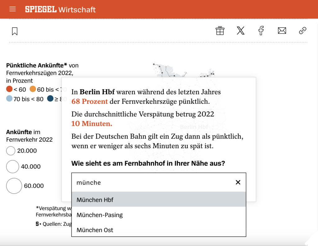
Thereafter, we tell the story from the reader’s perspective. And because people like to compare themselves to others, we answer the crucial questions: How does my station compare to the national average?…
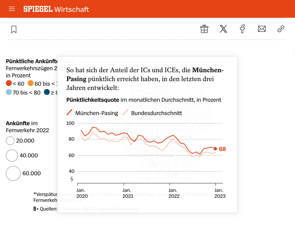
What stations in Germany do better or worse? Where are things worst, and where best?
The story follows a martini glass storytelling structure. We start with a narrow focus on a single station, continue by widening the focus and giving more context, to end with an interactive map to explore.
The process
I drafted the concept and the design of the entire storytelling in Figma. This allowed easy iterations with the colleague who did the data analysis as well as with the developers who finally implemented the storytelling.
See it live
- Interaktive Datenanalyse: So pünktlich sind die Züge an Ihrem Bahnhof (paywalled)
(Interactive data analysis: This is how punctual the trains are at your local station – published Jan. 25, 2023)