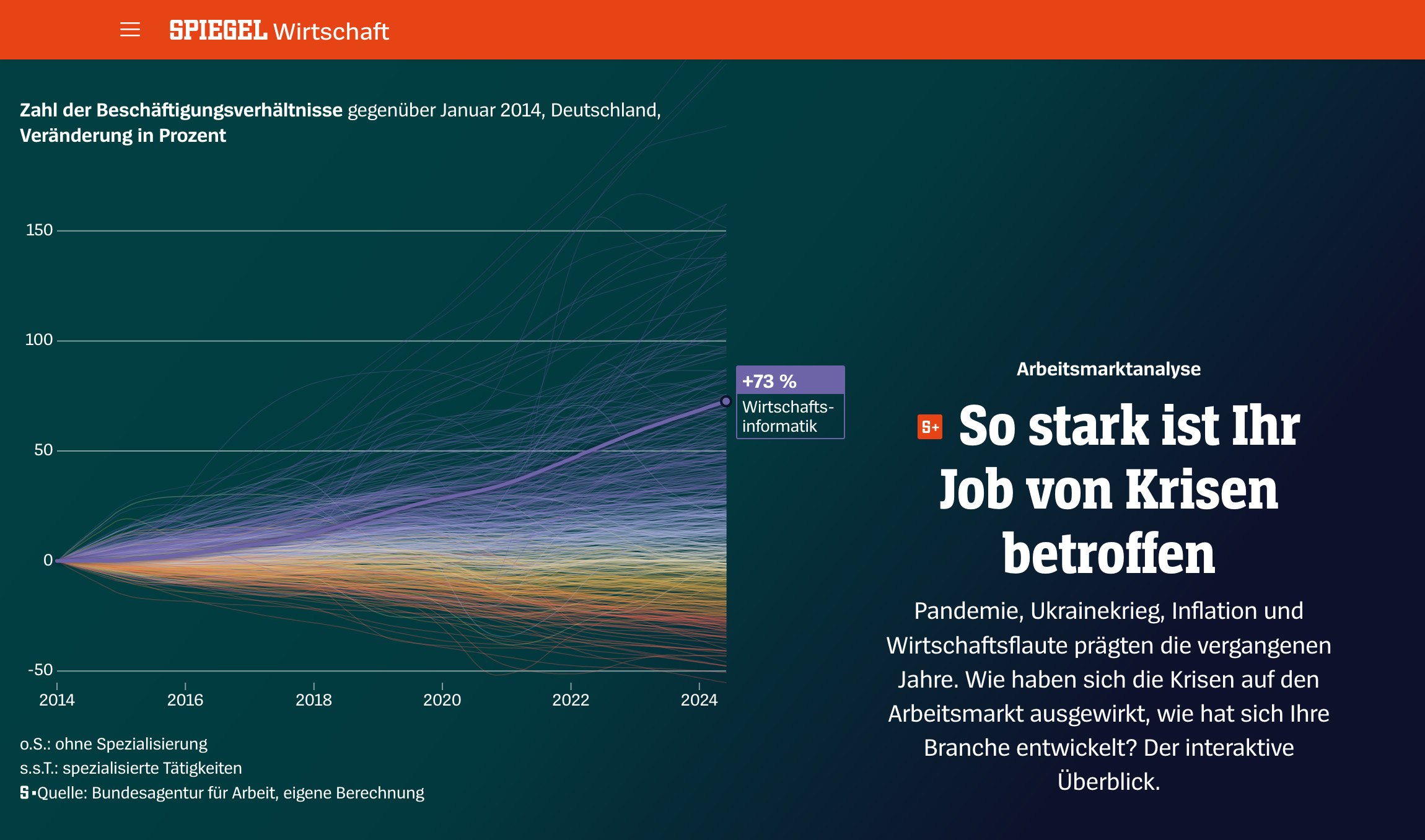
How did the pandemic, the war in Ukraine, the inflation and the resulting economic challenges shape the German labour market in the past few years? To answer to this question, I analyzed an extensive dataset from the »Bundesagentur für Arbeit«, the German federal employment agency – and visualized the results of our investigation in an appealing, interactive storytelling with compelling charts:
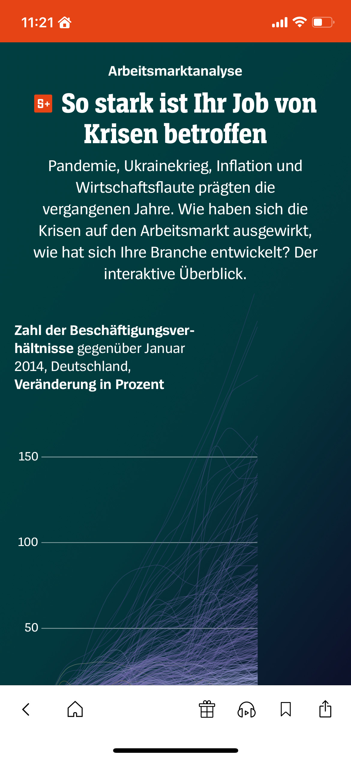
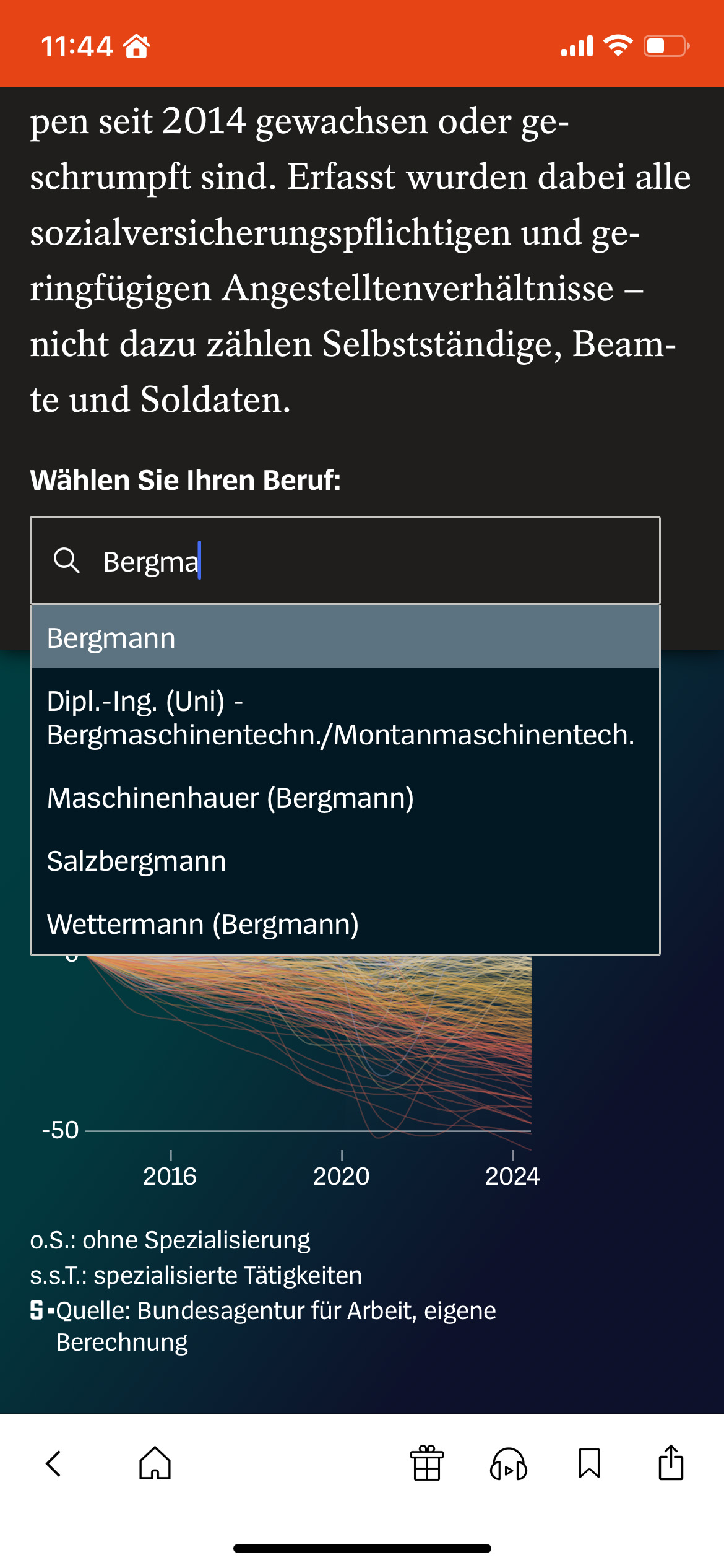
Readers may select their own profession in the beginning of the story. It is then shown as a reference in the further course of the story. When the user is not logged in as a subscriber, we kindly ask to subscribe in order to use this interactive feature.
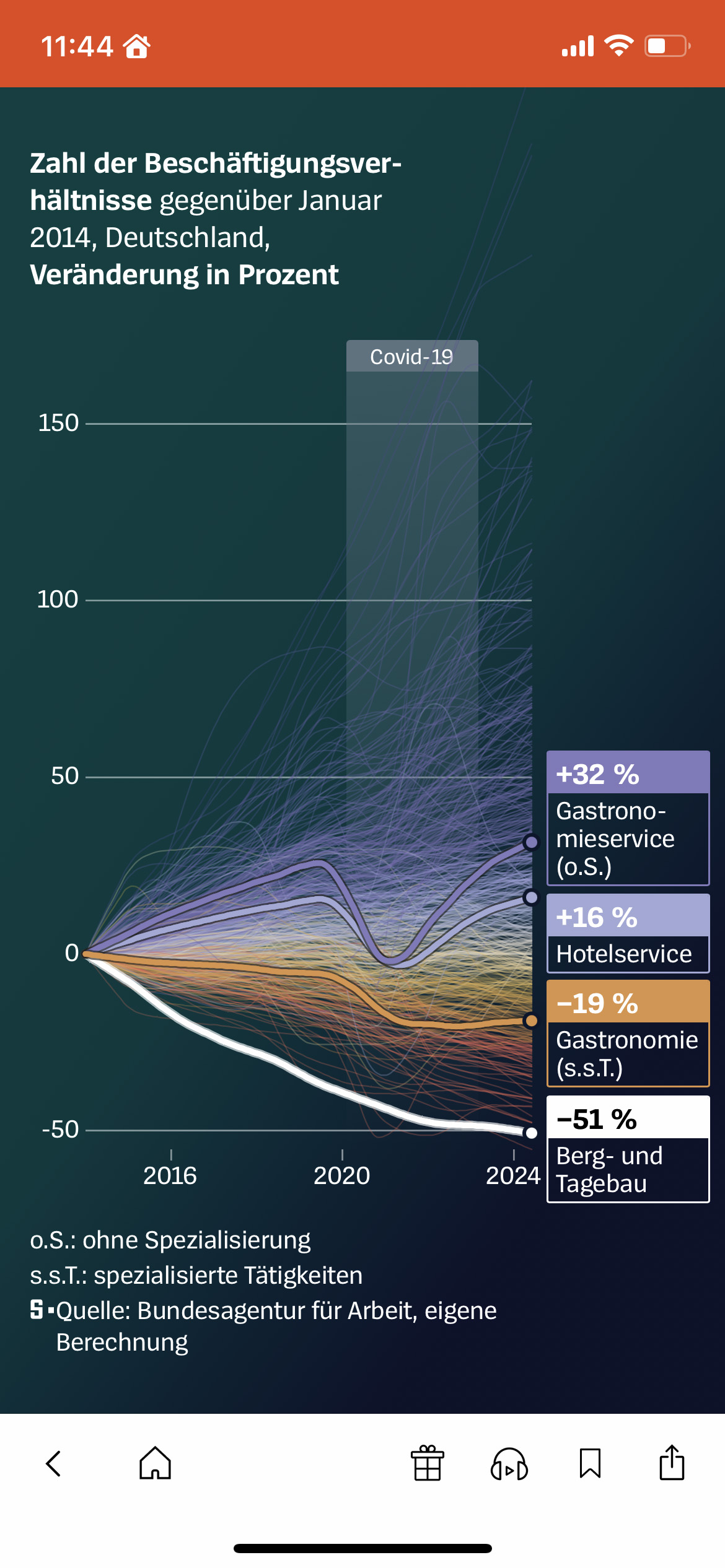
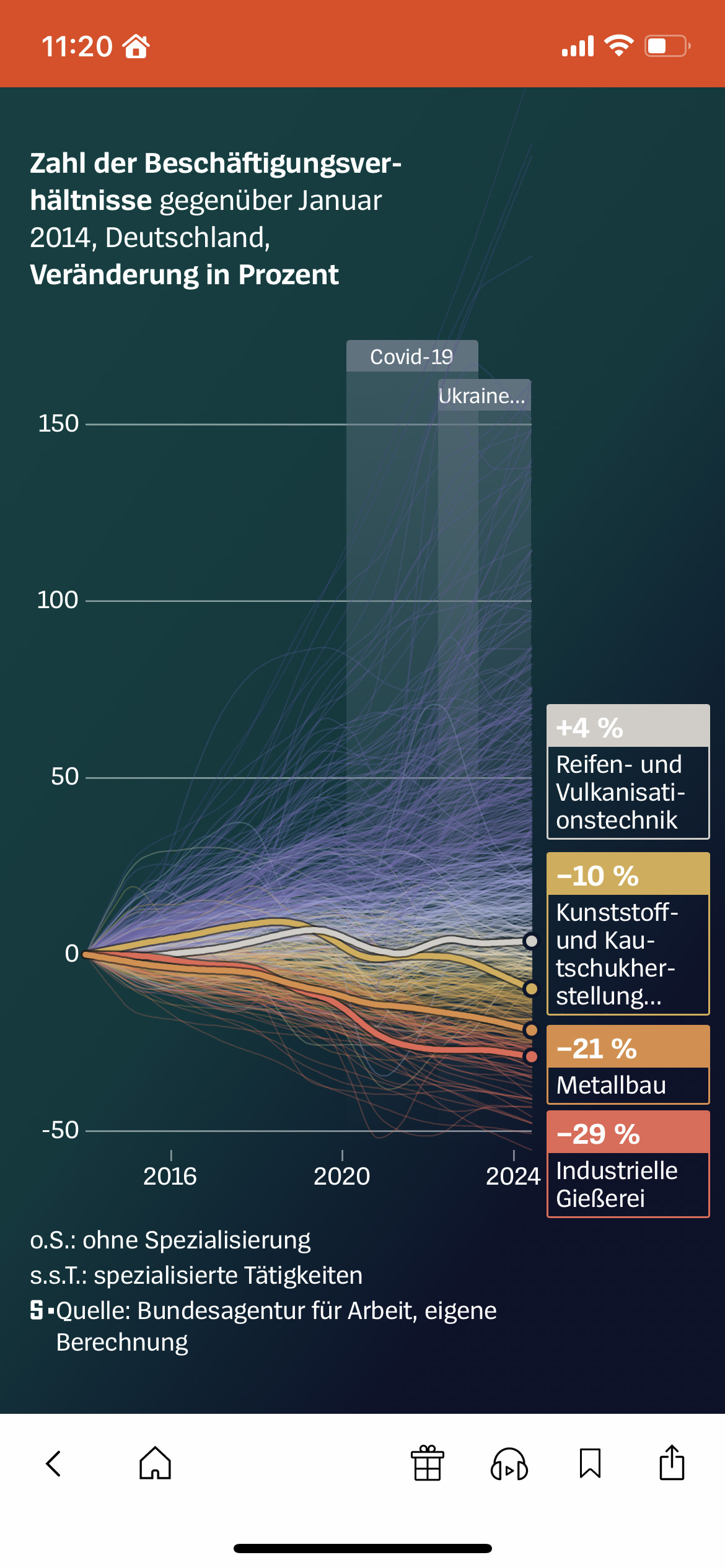
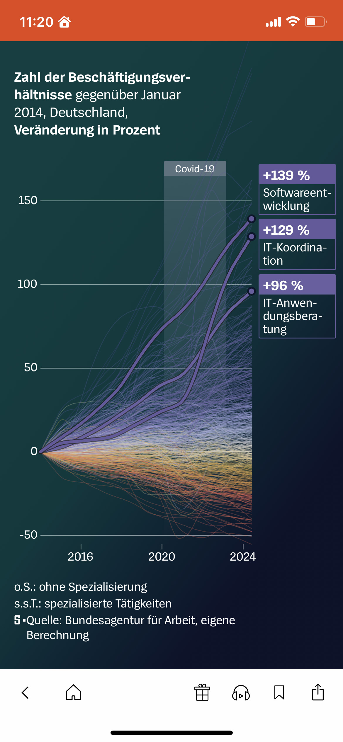
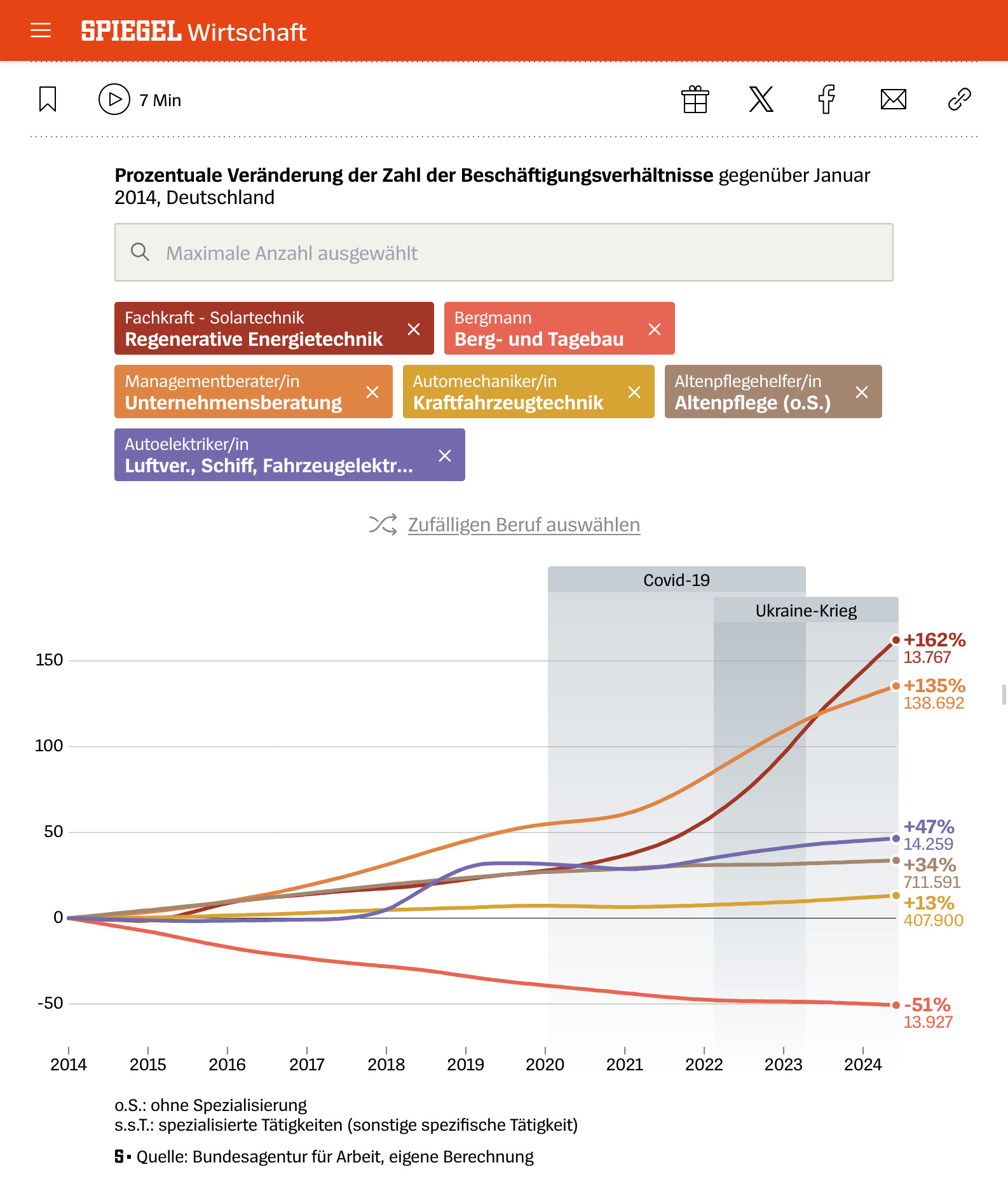
After I had worked out the concept for the story, my job was to do the data analysis and design of the visualizations, the storytelling and the copywriting. In the further process, I also wrote the code for the interactive chart that concludes the analysis while a colleague coded the scrollytelling. It allows the readers to freely explore the dataset by allowing them to pick up to six job groups for direct comparison:
See it live
- »How did crises affect your job?« (paywalled) – published at »Der Spiegel« on January 30, 2025